In this advanced tutorial, we’re going to show you how to take advantage of the many search options and data fields to precisely tailor your search in the GENetic Engineering Risk Atlas. When you are done with this tutorial, you should also be able to create informative charts from our built-in chart function. If you haven’t yet tried the basic tutorial, we recommend completing it before doing the advanced tutorial. The Glossary of terms both explains the information about each study and also has helpful search tips.
We have developed a very powerful combination of search options and chart functions that can help you find the information that you are looking for, and allow you to discover patterns in the research that may not have been seen before. By gathering all of the research on the relative risks of genetically engineered crops in one place, it allows us to ask fundamental questions about overall patterns that have not been possible before.
But with great power comes great responsibility. There are millions of possible search combinations and many chart options available, so remember to be cautious about making broad conclusions from your search results. The multiple comparison problem shows that with many possible combinations, some may show a pattern that is not real (false positive). In addition, while we are always improving and refining the information in the Atlas, GENERA does have its limitations, and it can be easy to misunderstand some of the options and what they mean. With these potential pitfalls in mind, let’s proceed with a practical example of advanced search and charting options to help you understand how to use GENERA to ask questions about the scientific research that has been conducted on genetically engineered crops.
Using charts for an overview
The chart function can be very useful for getting familiar with the scope of research cataloged in GENERA. To begin this tutorial, we’re going to explain more about how the charts work and how you can use them to check your search results and understand what you have found in your search. The chart function takes all of the studies that fit your search terms, and makes a chart of the field that you select, using Google Charts. It will group data that is the same together, and count them up to generate a pie chart. There are other chart options available for Google Charts, but the pie chart option was the most useful for the kinds of data contained in GENERA. So let’s use charts to look at the different types of funding so we can plan a search.
First, on the Advanced Search page, select Document type from the dropdown, write Journal article in the box, and click search. This will restrict our search to peer-reviewed journal articles.

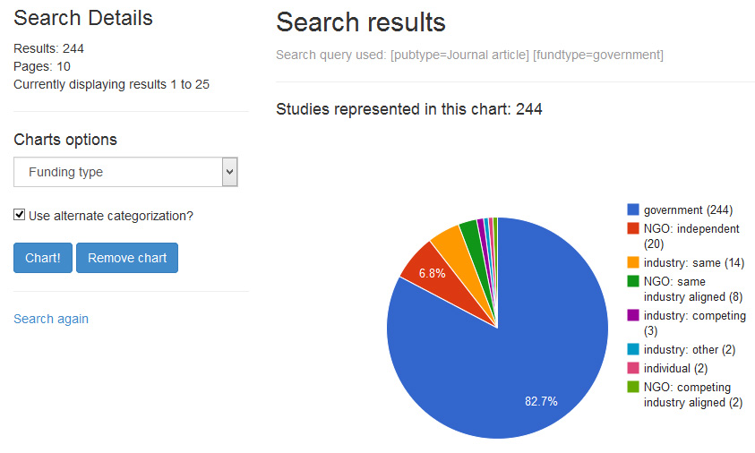
On the left, try making different charts of the funding sources, funding countries, and funding types. As you can see, there are a lot of different funding sources and types for the research included in GENERA. Some of the charts, such as for funding sources have so many pieces that you can hardly see them! Let’s take a closer look at the Funding type chart. It might look something like this:
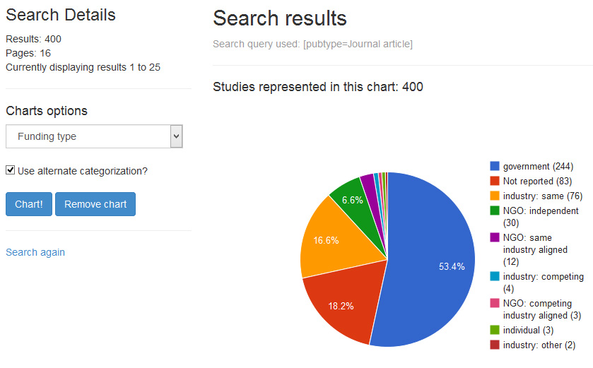
Your search results may differ since this chart is based on the first 400 studies included in the GENERA beta test. As you can see, government-funded studies make up a large proportion of the research, followed by studies that don’t report their funding source, and industry and nonprofit NGOs. But if you add up the number of studies in each category in this chart, you will find that the numbers add up to more than the total studies represented in the chart (457 > 400 in this example). What is going on? Some studies are funded by multiple sources and types of funding, and GENERA automatically counts each instance of a term separately, and counts them up. In the above example, there are 244 studies that have funding from government agencies, but some of these will also have funding from other types of sources such as industry or NGOs, and these studies will be counted twice (or three or four times) in this chart if it has that many types of funding sources. This is what the “alternate categorization” on the left does, but if you want to view each study individually without breaking up the funding sources like this, uncheck the Use alternate categorization box and click Chart again.
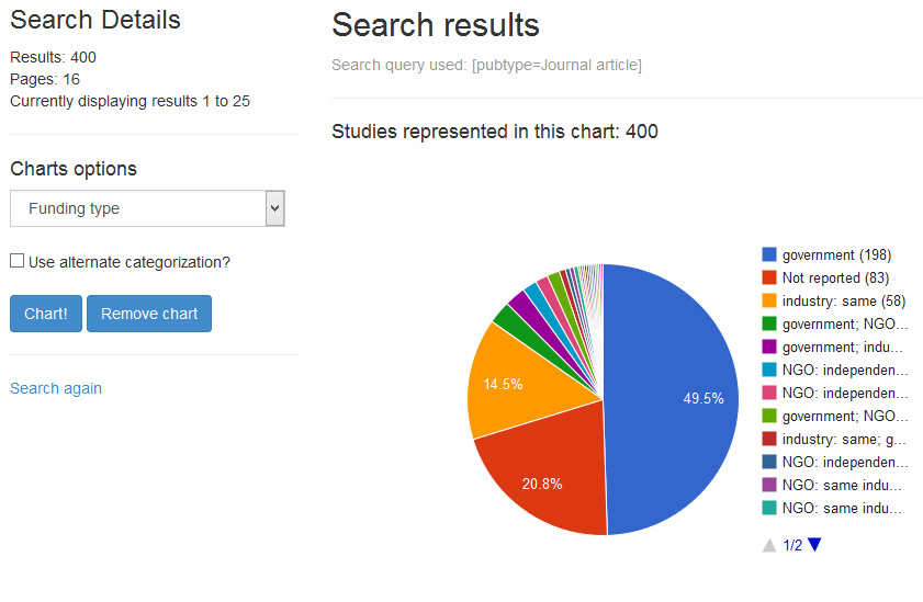
Now you can see the same chart, but the numbers will add up properly and you can see the actual proportions. So in this case, studies funded only by government agencies make up approximately half of the total, unreported studies make up 21%, studies funded by the same industry make up 14.5%, and there are many smaller pieces of the pie that include the studies that have different combinations of funding types. As you can see, this chart is more useful for getting the real proportions of studies, while it is harder to understand the funding sources for all those multiple-source studies. The alternate categorization of the first chart helps you see the data that is included in the studies that have more than one term, while skewing the overall proportions. Try making charts of some of the other fields that can have multiple options, such as GE trait, GE organism, Funding country, Country, and Test organism. Try these charts with both the alternate categorization checked and unchecked to compare them.
Tailoring your GENERA searches
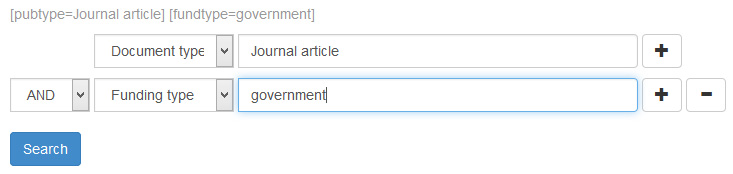
Now that you know how the chart options work, let’s do a complicated search to look at studies that are only funded by government agencies. As you know from the example above, studies can have multiple funding sources, and you can use charts to check your search to see what you have in your search results. Go back to the Advanced Search page, and search for Journal article under Document type, and add a second line to search for government in Funding type.
Now let’s check the funding types with a chart to see what we got in this search. Your chart should look something like this.
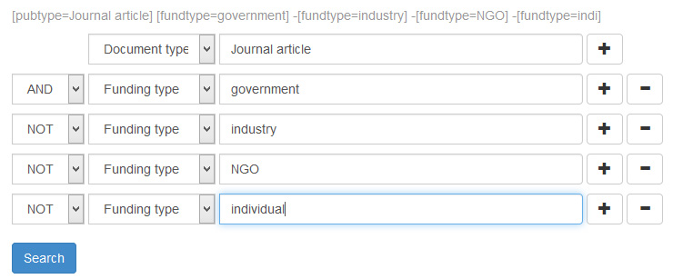
As you can see, there are many government-funded studies, but there are some studies that have funding from other sources. The search function finds all studies that contain the term you are looking for, but does not look for only that term. Let’s go back to the search page and try it again with a few more terms to refine the search. This time we’re going to search for peer-reviewed journal articles that have government as a funding type, but now we are going to exclude industry, NGO, and individual funding. To exclude a term from the search, add a line with the + symbol on the right, and in that new line, select the boolean AND operator on the left side of the new line and change it to NOT. Then select funding type from the dropdown, and type just the word industry in the box (do not select one of the autocomplete options). Since there are several different types of industry sources (same, competing, and other) this will exclude all studies with the word “industry” in the funding type field. Repeat this process for the word NGO and the word individual on two more lines. Your search options should look like this.
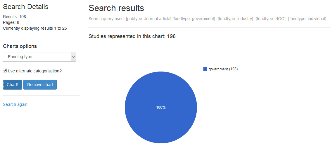
This will search for studies that are funded only by government agencies. Recall how many government studies there were after we unchecked the alternate categorization box above: 198. How many studies are in our search now? This chart shows it all.
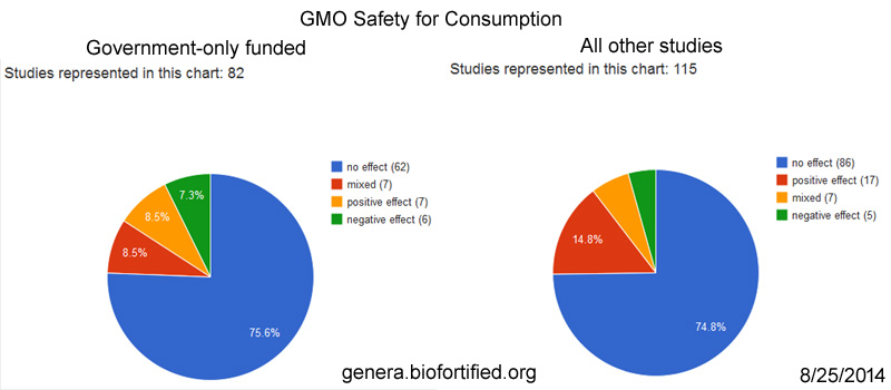
Now we have a search that is precisely tailored to what we are looking for, in this case studies that are only funded by government agencies, and we can start to ask questions about the research outcomes, countries where the research was done, what crops were researched, and look at each study individually. While this was an example of choosing studies solely based on their funding source, don’t let those details obscure the underlying science. If you were to compare the safety for consumption between the government-only funded studies and all other studies, you would find a similar pattern of results. Thanks to GENERA you can now do that.